Ecommerce Experience Design

A refresh that rebuilt the US Shopify site as an education-first ecommerce experience, pairing premium Japanese products with the recipes, guides, and chef endorsements American home cooks needed to understand and use them.
Kayanoya background
Kayanoya is a premium Japanese food brand from Kubara Honke, a family-run maker rooted in a Meiji-era soy sauce brewery founded in 1893. It grew from a restaurant focused on seasonal ingredients and traditional food preparation into a brand that now offers a full range of seasonings, and that heritage still runs through everything it makes today.
Its range spans the Japanese pantry: dashi, soy sauce, seasonings, soups, noodles, drinks, and gift sets, with Kayanoya Dashi, the kelp-and-bonito stock at the umami base of Japanese cooking, as the signature product.
Overview
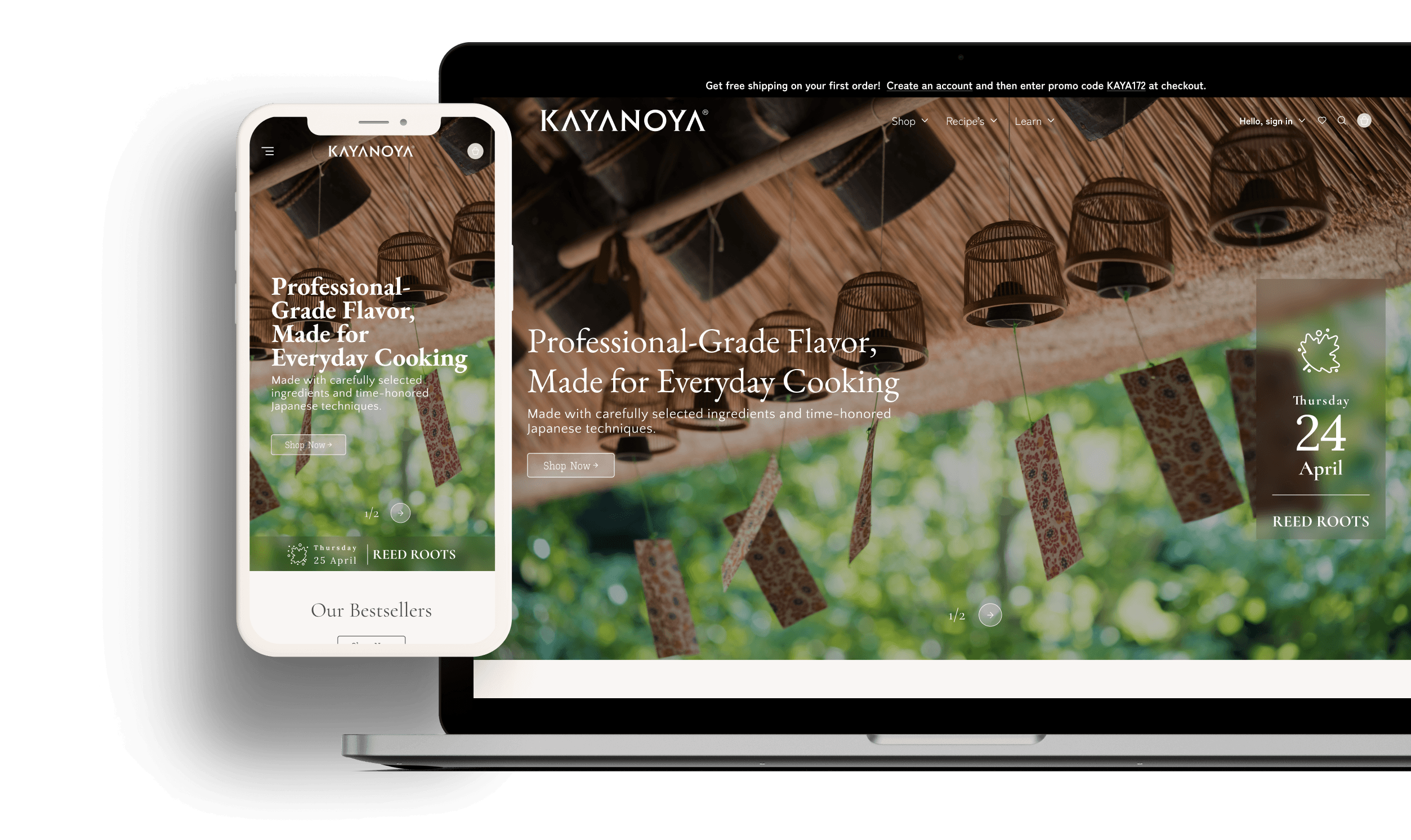
A ground-up rebuild of Kayanoya's US Shopify store as an education-first commerce experience, where category learning becomes the site's conversion engine.
At a glance
Going beyond e-commerce
The challenge
Kayanoya is transitioning into the American market. First-time buyers arrived curious and left uncommitted. The gap was not the interest in the products; it was the confidence to buy a product they did not yet know how to use.
The solution
The redesign turned Kayanoya's website into more than a place to shop. It became a space where visitors could explore, learn, and feel confident enough to decide, which is how education turned into conversion. A three-layer content model in which each layer carries the next: commerce is the heart of the site, education makes the category understandable, and culture makes the brand distinctive, so that learning, trust, and purchase all happen in the same flow.

Measurable impact
The main goal was to convert curious visitors into buyers, and also to create loyal customers who return to learn and explore.
Buyers grew confident in the product, with the rate climbing from 3.9% to 5.7%. Moving education into the buying flow gave first-time Kayanoya buyers the confidence to commit instead of leaving.
More qualified traffic reaching the site, after four Google Merchant Center accounts were consolidated into one and recovered the paid-search visibility that had been splitting across duplicate feeds.
Fewer drop-offs at the final step, with more people moving from cart to completed order. Consolidated product pages, visible reviews, and Google Shopping star ratings gave buyers the reassurance they needed.
Design discovery
Research
Interviews
- Premium, editorial sensibility
- Heritage with US accessibility
- Education as the conversion engine
- Customisable seasonal content
- Trust through endorsement & transparency
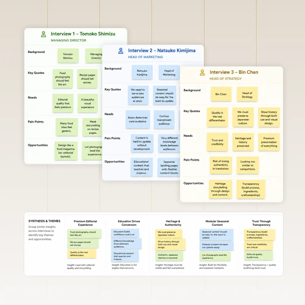
Stakeholder Interviews
I sat down with Kayanoya's American team: Tomoko Shimizu, Natsuko Kimijima, and Bin Chen. They saw quality as the differentiator, and wanted Kayanoya's long Japanese culture and history preserved in both the use and the visual layout. There was also a need to have visual updates on seasonal elements themselves, like seasonal recipes and micro seasons. Grouping their needs and pain points, five themes kept surfacing that shaped the strategic direction.

The Operations Audit
The audit confirmed where the architecture was breaking down.
- Content was not connected. 115 pages, no education layer, and recipes never linked to the products they used.
- Trust signals were weak. No star ratings on Google Shopping while competitor Ajinomoto Hondashi showed nearly five, and chef endorsements were hard to find.
- Operations split the experience. Three inventory systems ran in parallel, and four Google Merchant Center accounts fragmented paid-search visibility.
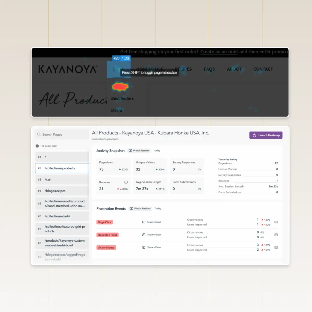
Behavioural Analytics
I analysed how visitors actually behaved with GA4 and Lucky Orange, and the story was consistent: attention was never the problem. Sessions ran long, an average of 7:27 minutes, but add-to-cart sat at 3.9% while cart-to-order held at 41.6%. The challenge was conversion into the cart, not at checkout. The heatmaps gave me the clue I needed. Shop and How to Use were the two most-clicked items, a signal that buying and learning mattered equally to visitors. But the learning lived apart from the products, which sent users back and forth between the two. It was blocking conversion.
The Audience
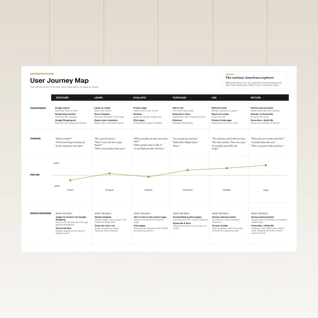
Research showed that the redesign landed on the umami trend. It has become one of the defining tastes shaping how Americans cook, as global cuisines grow more accessible and social platforms make restaurant-style cooking feel achievable at home. It is increasingly used to add savoury depth while cutting sodium, made from high-quality ingredients, which is exactly what Kayanoya offers. Dashi is how umami is made from scratch, so a once-niche category now has a cultural tailwind. That trend shaped two audiences I had to serve at once: the curious American explorer and the Japanese-fluent regular.
system
Solutions
The three-layer model in execution — Commerce, Education, and Culture, turned into features users actually touched.
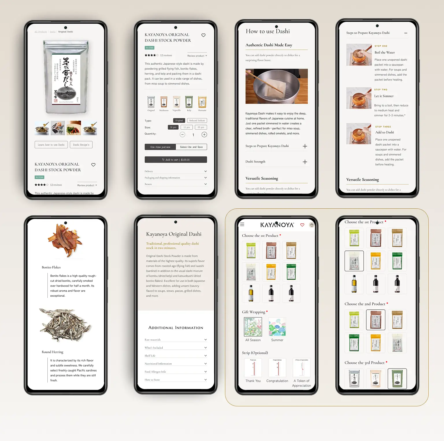
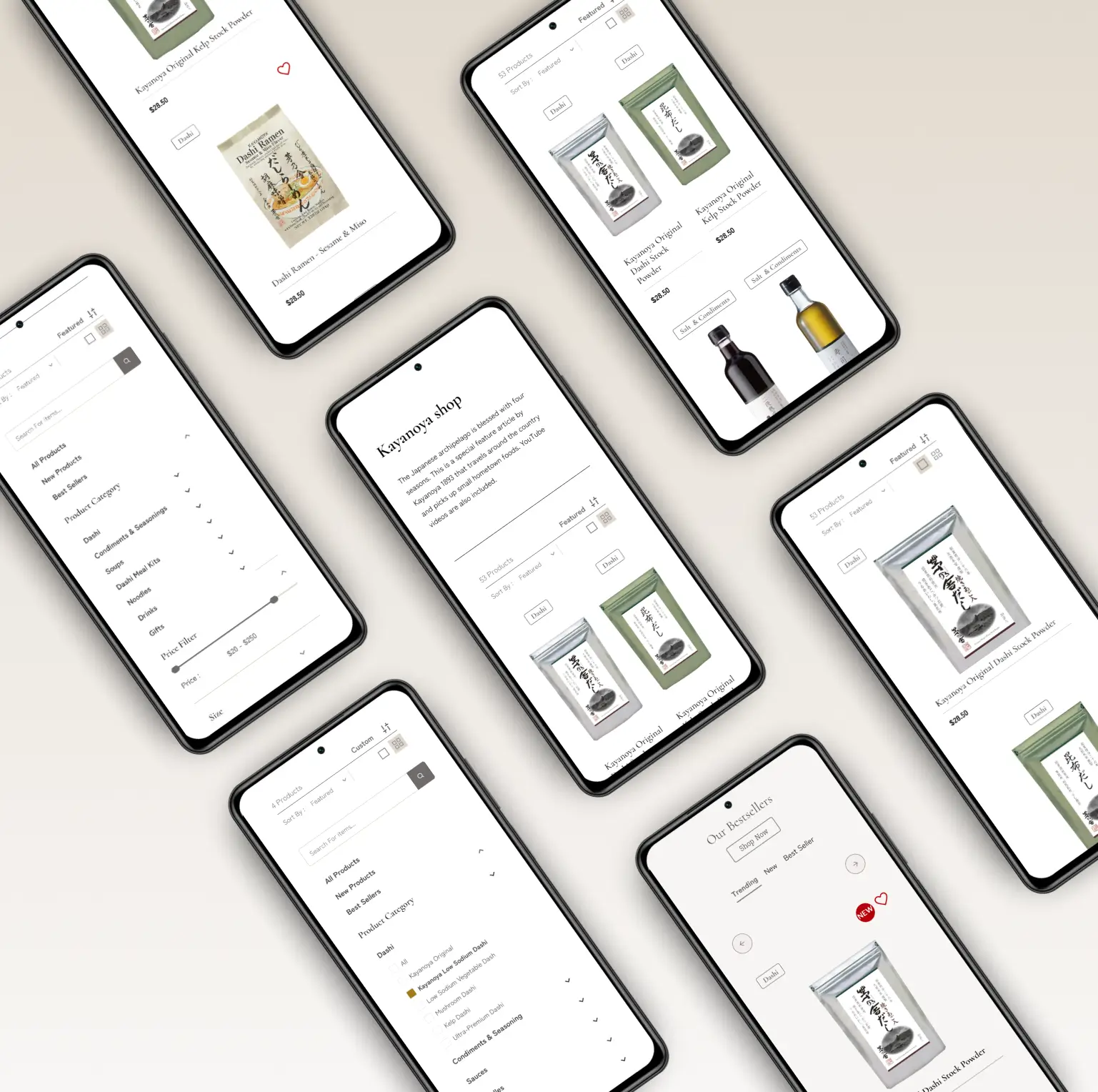
We set Shop and Learn side by side in the navigation, mirroring the two intents the heatmap surfaced, and consolidated sizes, types, and sodium variants into single product pages, so a buyer selects a variant instead of hunting for a separate listing.
Guided by Jakob's Law — people spend most of their time on other sites, so familiar patterns lower the learning curve — every dense surface revealed only what was needed, when it was needed: capped navigation depth and top-aligned filters on mobile, a hover-revealed mega-menu and sequenced product information on desktop.
We built learning into the flow rather than beside it, with clickable recipe hotspots that move a shopper from dish to product, How to Use surfaced on the product page, and eight illustrated, video-led guides that translate Kayanoya's Japanese packaging for US cooks.
We surfaced customer reviews and chef endorsements where they affect the decision, and fed star ratings into Google Shopping, giving first-time buyers proof the brand is worth it.
We carried a Japanese sensibility through editorial typography and large-format photography, with two custom icon sets: one for seasonal ambience, one for category wayfinding across a dense range.
We built editable seasonal moments the client can rotate without development, led by a Micro Seasons header that refreshes its icon and date every five days. Beyond the first purchase, rewards, refer-a-friend, and Subscribe & Save turn a confident first order into a repeat habit.
We gave the blog a clear identity as Stories — three ongoing series that keep the culture layer alive between launches:
- Cooking Stories — recipes
- Kayanoya Spirit
- Kayanoya People's Voice
“Education as architecture, documentation from day one, and one question to stay honest: does this help someone understand, trust, or use dashi?”
learned
The standard Shopify product page put detail up top, which buried the buying moment behind a wall of text. Reordering it — product first, How to Use second, detail last — fixed the funnel. Conventions assume typical content; a heavy education layer needs its own rules.
The custom metafield system was powerful but complex, so I documented it end to end. The site built to teach home cooks how to use dashi also had to teach the team how to run it.
With more structured sections than a usual store, every product had to fill them to the same standard, and the gaps only showed at delivery. Next time, I would lock content shape up front, not after the templates are built.