Background

Kayanoya is a premium Japanese food brand from Kubara Honke, a family-run food manufacturer founded as a soy sauce brewery in 1893.
Its range spans dashi, soy sauce, seasonings, soups, noodles, drinks, and gift sets, with Kayanoya Dashi as the signature product.
Challenges Spark Innovation
At a glance
The challenge
Kayanoya had attention but not conversion. American shoppers were spending nearly eight minutes on the site, but only one in twenty-five reached the cart. Most did not understand what dashi was, how to use it, or why the brand was worth its premium.
The solution
To turn category education into a conversion engine, I developed a three-layer content model where each layer builds on the next. Commerce makes the site shoppable. Education makes the category understandable. Culture makes the brand distinctive. Together, they let learning, trust, and purchase happen in the same flow.
Purchase flow
-
ONE
Understanding / Education
Introduce dashi and the broader Kayanoya range to an audience unfamiliar with the category.
-
TWO
Trust
Make quality, reviews, and chef endorsements visible to first-time buyers.
-
THREE
Purchase path
Reduce friction between discovery, education, and add to cart.
Results
-
+46%Add-to-cart rate
-
+31%Sessions
-
+15%Cart-to-order rate


DESIGN DISCOVERY
RESEARCH
Tomoko ShimizuManaging Director
Editorial elevation. Food photography treated as art. Recipe pages as brand storytelling. A clearer leadership voice. The Japanese Kayanoya site as the tonal anchor.
Natsuko KimijimaHead of Marketing
Two audiences served at once: an Asian-American core already familiar with dashi, and a curious mainstream growth audience that was not. Modular seasonal content the team could update without development.
Bin ChenHead of Strategy
Quality as the differentiator. Education as the mechanism for making that quality visible. Sustainability and process transparency as core storytelling pillars.
Across the three conversations, five themes recurred:
- Premium, editorial sensibility
- Heritage with US accessibility
- Education as the conversion engine
- Customisable seasonal content
- Trust through endorsement and transparency
Attention was already there
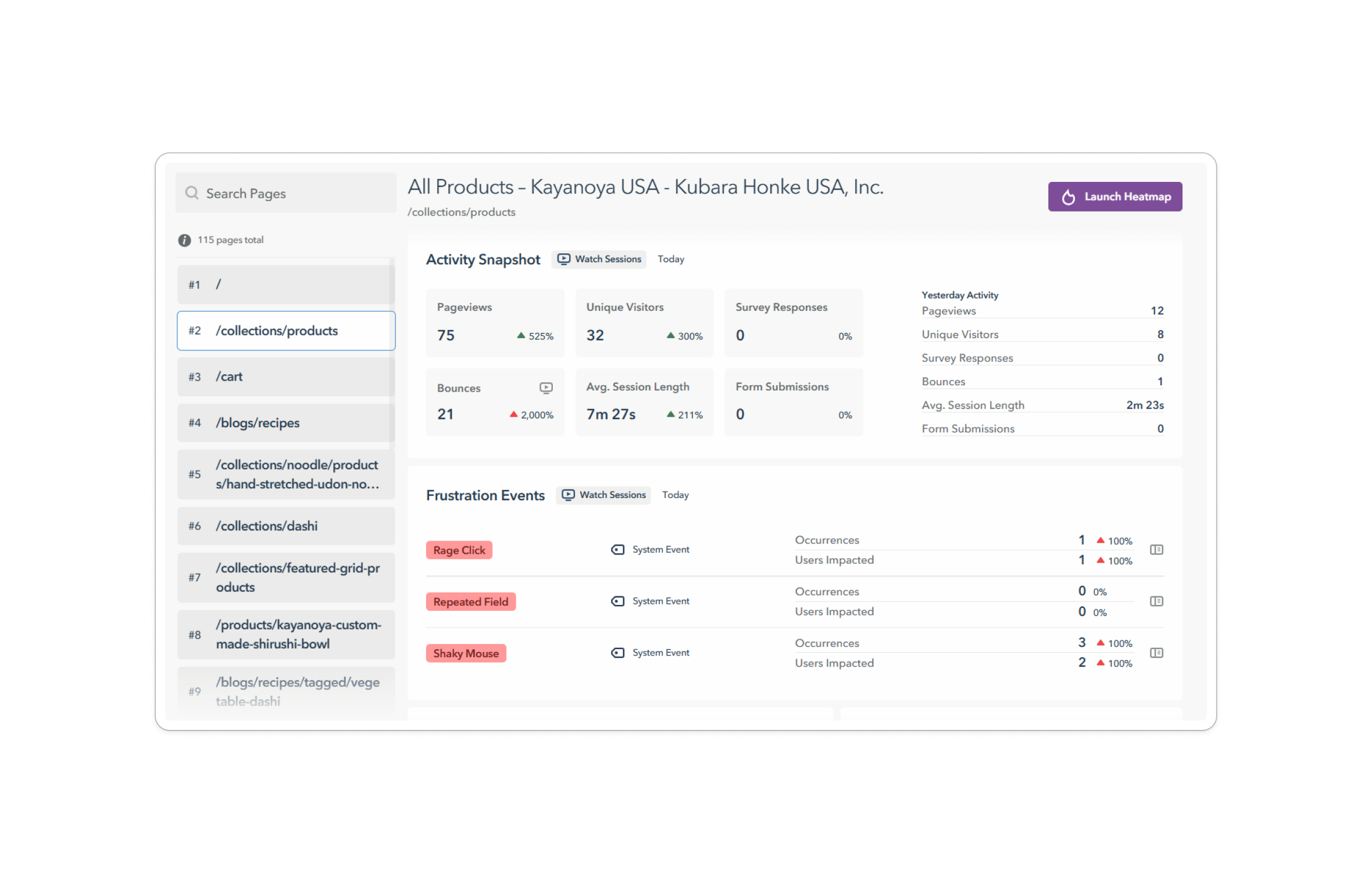
Average session length reached 7 minutes 27 seconds. Visitors were willing to spend time with the brand, which ruled out an awareness problem.
The leak happened before commitment
Add-to-cart rate sat at 3.9% across 4,477 sessions, while cart-to-order rate was 41.6%. The larger drop-off happened before users committed to the cart, not after. That pointed to an education and confidence problem higher up the funnel.
Product discovery was creating friction
Bounce rate on the products page spiked sharply during the audit period, indicating that product structure was making it harder to move from browsing to selecting.
Users were trying to buy and learn at the same time
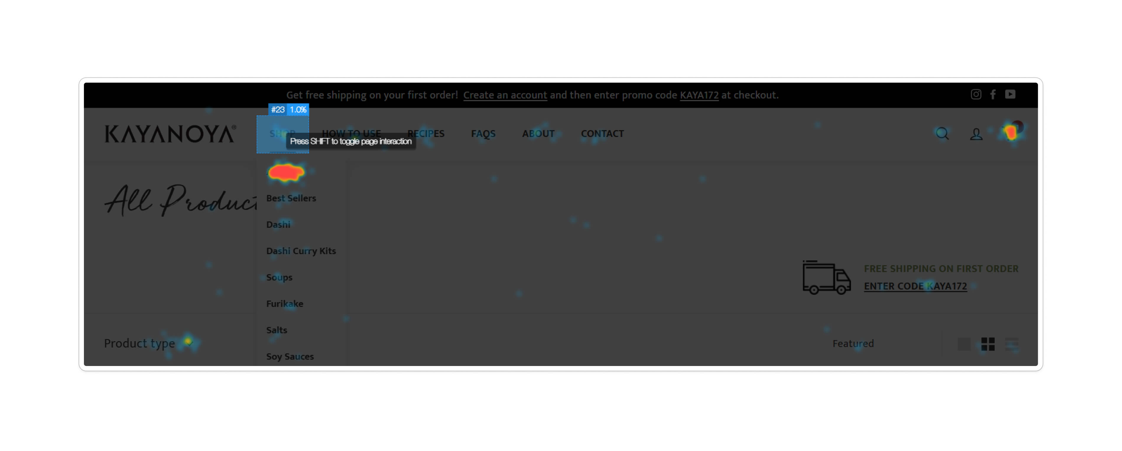
Lucky Orange heatmaps showed Shop and How to Use Dashi as the two most-clicked items in navigation. Visitors were signalling two intents at once: shop now, but also learn enough to buy confidently and to use the product after it arrived.
Mobile had to carry the learning layer
69% of traffic came from mobile, compared with 28% from desktop. Any education strategy had to work inside a constrained mobile interface rather than being treated as secondary desktop content.
The site did not have an attention problem. It had an architecture problem.
Content existed, but it was not connected
The site held 115 pages with no education layer organising them. Recipes existed, but they were not linked to the products they used. A user could discover content without ever being moved toward purchase.
Post-purchase guidance was missing in English
Kayanoya's product packaging carries usage instructions in Japanese only. Once the box arrived, US customers were left without support on either the package or the site. First-time buyers were being stranded at exactly the moment they needed the most reassurance.
Trust signals were weak or missing
Kayanoya's Google Shopping ads showed no star ratings, while competitor Ajinomoto Hondashi displayed nearly five. Chef endorsement content also existed without a clear structure for discovery, so credibility was not being applied where it could affect purchase.
Operational systems were splitting the experience
Three inventory systems were running in parallel, with no unified expiration-date tracking. Four Google Merchant Center accounts were also running simultaneously, splitting paid-search traffic and weakening product visibility.
Five findings, one diagnosis. The site did not need more content. It needed an architecture that connected what was already there.
The Art of Reduction
UX Solution
The research pointed to one clear direction: Kayanoya already had the content. What it needed was a structure that could teach, reassure, and sell at the same time.

The response was a three-layer model.
Commerce as the baseline. Make products easy to find, compare, and buy.
Education as the conversion layer. Help new and existing buyers understand what dashi is and how to use it.
Culture as the depth layer. Preserve the Japanese character, rituals, and seasonal cues that make the brand distinctive.
How do we keep users engaged and not overwhelmed?
Boring
The strategy centres on Jakob's Law: users spend most of their time on other websites, so they expect Kayanoya to work like the ones they already know. Mirroring familiar ecommerce patterns reduces cognitive load and smooths the learning curve, particularly for first-time buyers who already face a category education hurdle in dashi.
Magic
The remaining 30% is where the brand earns distinction. Typography, spacing, tone, and the small UI choices that carry Japanese sensibility into a US ecommerce frame without making the user work for it.
Information System
Architecture
The strategy needed a system underneath it. The architecture was planned in sequence: who the user is and what they need, where those needs sit on the site, how the pages connect, and what the platform needs to do to support it all.
5.1 User journey
The team mapped the path from first-time discovery through repeat purchase, overlaying education, trust, and conversion touchpoints at each stage.
The journey map became the coordination tool between content strategy, design, and development. It clarified where to teach, where to reassure, and where to close, and it set the requirements every other architecture decision had to meet.

5.2 Sitemap
The new architecture organised the site around two parallel commitments: shopping and learning. Fifteen templates sat under those two parents, with cross-links where content needed to behave relationally.
Recipes link to products. Products link to guides. Chefs link to recipes. Micro Seasons link to seasonal content.
Editorial on the back end. Relational on the front end.

5.3 Metafield architecture
Shopify's native CMS supports products, collections, and blog posts. It does not natively support the relational references this experience required between recipes, products, chefs, guides, and seasonal content.
Paramjeet built a custom metafield and metaobject system that turned editorial choices into structured features.
Three layers made the system work:
- Metaobjects: Chef, Micro Season, Product Guide
- Product metafields: related recipes, related guides, video URL, sodium level, sourcing origin
- Recipe metafields: featured products with hotspot coordinates, chef attribution, season, cuisine, dietary
These relationships compose across the site. A chef appears on their own page, on the recipes they signed off on, and inside the product context those recipes support. None of it is hardcoded. The team can add a chef, tag a recipe, or rotate a Micro Season without touching code.
Invisible to the user. Fundamental to the experience.

5.4 Shopify app stack
The app stack extended Shopify into the experience the brief required. Each app addressed a specific gap surfaced in research.
- Judge.me: reviews on site, plus a feed into Google Shopping star ratings
- Klaviyo: lifecycle email, including welcome, abandoned cart, and post-purchase education
- Accessibly: front-end accessibility support
- Subscribe and Save: retention for products that become pantry staples
- Notify Me: capture intent on out-of-stock items
- Favorites: save products and feed signals into lifecycle marketing
Beyond the app layer, two platform consolidations cleared structural noise. Three inventory systems were unified into a single Shopify backend with Amazon channel sync and batch-level expiration tracking. Four Google Merchant Center accounts were collapsed into one, recovering paid-search visibility that had been splitting across duplicate feeds.

Built System
Solutions
The architecture made the strategy buildable. The solutions made it visible.
This section follows the three-layer model in execution: Commerce first, Education second, Culture third. Each tier shows how the strategy translates into specific design and ecommerce decisions, with the boring ones doing the foundational work and the magic earning the distinction.
Tier 1 of 3: Commerce baseline
The 70% Boring, made specific. Architecture and ecommerce essentials, calibrated to Kayanoya's category and audience.
6.1 Shop and Learn as parallel primary navigation
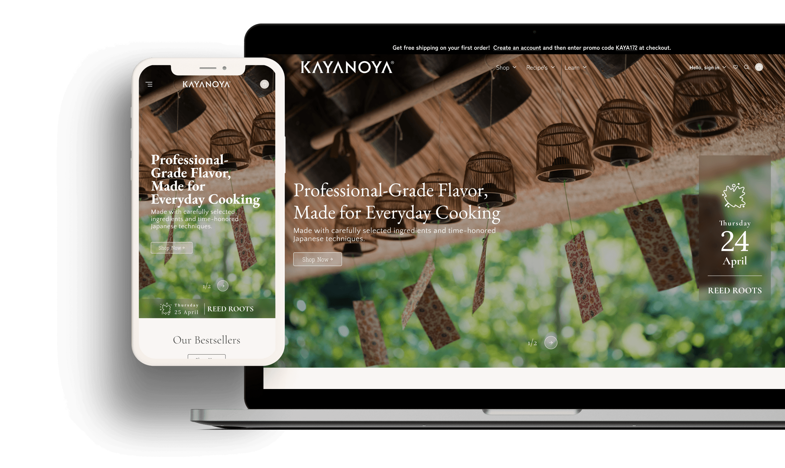
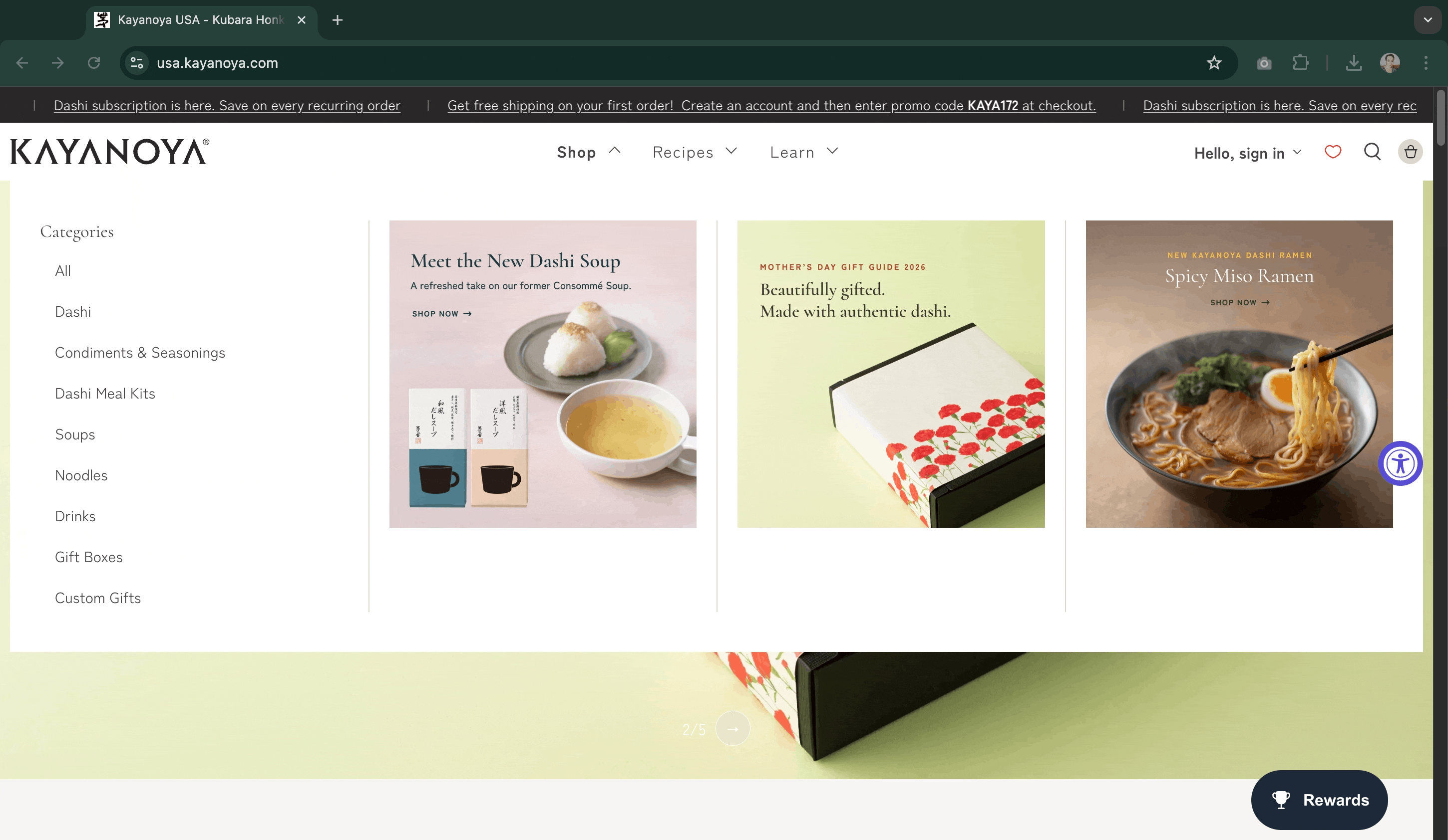
The heatmap surfaced two equal peaks of intent: Shop and How to Use Dashi. The architecture mirrored the data. Shop and Learn sat side by side in the primary navigation, each with its own dropdown and logic. Shop carried the products. Learn carried recipes, guides, chefs, and brand story. Visitors with intent to buy went one way. Visitors with intent to understand went the other. The two paths crossed constantly.
6.2 Consolidated product pages
Sizes, types, and sodium variants now live inside a single product page rather than across fragmented listings. A user looking for low-sodium soy sauce does not have to discover that it is a separate product. They select it from a variant. This reduced structural friction on the product page and supported a more mobile-friendly buying flow.

6.3 Progressive disclosure
The site carried too much content to present all at once. Every dense surface had to choose what to show, what to hold back, and what to reveal only when the user signalled intent.
Mobile
Where most traffic lived, mobile set the constraint. Navigation depth was capped. Filters sat at the top of collection pages rather than in a side panel. Hero moments were reserved for the homepage so product and collection pages could deliver decision-relevant content early. Dense templates used sticky secondary navigation to keep deeper content one tap away.
Desktop
Where the catalogue had room to breathe, desktop layered the same logic differently. The mega-menu held the breadth of the range but revealed it only on hover or tap. Product pages sequenced their information: product first, How to Use second, detail third. The most decision-relevant content stayed above the fold and the rest unfolded as the user committed.
Progressive disclosure was not a single feature. It was the rule every dense surface had to follow.

6.4 Considered ecommerce essentials
Smart filters across products and recipes. Unified search across products, recipes, and articles. Subscribe and Save for pantry-repeat products. Judge.me reviews feeding Google Shopping star ratings. Favorites and Notify Me feeding lifecycle marketing. Structured data for recipe rich results. Accessibility decisions across interaction, motion, and content. A 301 redirect map protecting inbound links and search equity at launch.
None of these are unique on their own. The value was in choosing the right ones, integrating them cleanly, and fitting them to Kayanoya.

Tier 2 of 3: Education becomes visible
The interaction layer where strategy turns into something shoppers can see, touch, and learn from.
6.5 Recipe hotspots
Recipe images carry clickable hotspots, allowing a user to move from recipe to product without leaving the image. Hotspot coordinates are stored in recipe metafields, so editors can add them to new recipes without developer help. Education becomes commerce in the same gesture.

6.6 Hero mega-menu
The mega-menu doubles as a merchandising surface. Featured products, recipe spotlight, seasonal highlight, and range navigation sit together. The homepage stays restrained, while the menu becomes a deliberate tool for surfacing breadth and steering traffic.

6.7 Educational shop hover
The shop hover surfaces educational content alongside the product link, so even a moment of browsing teaches something. A small interaction that turns the navigation itself into a learning surface, rather than waiting for the user to reach a guide or recipe page.

6.8 Chef index and chef single templates
Dedicated chef pages give partners a visible role in the site, with biography, recipe connections, and product relevance. For a first-time dashi buyer, chef endorsement becomes an immediate credibility signal rather than background brand content.

6.9 How to Use surfaced on the product page
The heatmap finding carried all the way through the design. How to Use Dashi was one of the most-clicked items in navigation, so the product page itself had to carry a clear How to Use section. A buyer no longer had to leave the product page to learn how to use the product.

6.10 Product Guides with step-by-step video
Eight illustrated, video-led guides translated the Japanese back-of-pack instructions for US shoppers, from How to Use Dashi to How to Prepare Chawanmushi Mix. Each guide was embedded directly inside the relevant product context. The customer support issue surfaced in research became a durable product feature.

Tier 3 of 3: Culture, made visual
Where the brand earns its distinction. Culture is not background here. It is applied through every visual decision, from typography to icons to the seasonal surfaces the team can rotate without development. Tiny details, big impact.
6.11 Editorial visual language
The UI used contrast deliberately. Serif display typography carried heritage, appetite, and calm. Simpler sans-serif UI text handled navigation, product information, and controls. Large-format photography did most of the emotional work, while the interface stayed restrained through quiet navigation, outlined buttons, translucent overlay cards, and generous spacing. The site needed enough atmosphere to feel premium and enough clarity to remain shoppable.

6.12 Icon systems
One icon strategy, two applications. The Micro Seasons set turned seasonality into an ambient brand cue rather than an explanatory block of copy. The category set helped break a dense, unfamiliar product range into faster visual recognition in navigation, filters, and merchandising surfaces. Same visual language, different jobs. Both made the catalogue easier to approach without making the interface louder.
6.13 Seasonal editable surfaces
Three surfaces the team can rotate without development. The Micro Seasons header animates a custom icon and date card every five days, each tied to a traditional Japanese microseason. Recipe headers refresh with seasonal recipes and seasonal backgrounds. Kayanoya Inspiration translates and shares regionally rooted Japanese culinary content as a structured editorial format. Together, these surfaces give returning visitors a reason to come back and give the brand a rhythm a static site cannot carry.

Results
Outcomes
The refresh was designed to convert attention that was already there. The post-launch numbers show that engagement, which had not been the problem, was now feeding the funnel.
| Metric | Before | After | Change |
|---|---|---|---|
| Add-to-cart rate | 3.9% | 5.7% | +46% |
| Cart-to-order rate | 41.6% | 47.9% | +15% |
| Sessions | 4,477 | 5,849 | +31% |
The hypothesis held. Education built into the shopping experience moved more visitors from interest to purchase, without the site having to fight for new attention.
What I learned
Reflection
Convention is a starting point, not a rule
Standard Shopify product pages place additional information near the top of the product detail page. On Kayanoya, that arrangement broke the funnel. The amount of content needed to teach a first-time American buyer was large enough that users hit a wall of text before they reached the buying moment. Moving additional information below the How to Use section created a better sequence: product first, guidance second, detail third.
Ecommerce conventions are calibrated for typical content density. Premium brands with a heavy education layer need calibration of their own.
The site had to teach the client too
The custom metafield system solved the relational content problem, but it introduced complexity the client team needed to manage confidently. That led to a step-by-step documentation set covering naming conventions, template logic, and content entry patterns.
The site, designed to teach American home cooks how to use dashi, also had to teach the Kayanoya team how to maintain its own architecture.
Content shape is an architecture decision
The site had more structured content sections than a typical Shopify storefront. For the architecture to read consistently, every product had to populate those sections to a similar standard. Variance showed up at delivery, not at design review.
If I ran this project again, I would standardise content earlier and treat content shape as a Tier 1 architecture decision, not a delivery-phase cleanup. Designing the template is half the job. Designing the content shape that fills it is the other half.
What I carry forward
- Education as architecture when teaching is part of conversion.
- Custom metafield systems as a design tool, with documentation included in scope from day one.
- A single user question to guide decisions: does this help a home cook understand, trust, or use dashi?
What is next
Three moves would extend the work: validate the model with direct user interviews, build a content style guide for recurring structured sections, and expand the chef programme using the existing content system.